
In today’s digital-first world, your clients aren’t sitting behind desktops all day. They’re browsing, shopping, and connecting through their phones. That’s why mobile web design isn’t just a design choice; it’s a business necessity. Whether you’re in Australia, the UK, or the USA, delivering mobile-optimised websites has become one of the most crucial parts of successful web design.
Why Mobile Web Design Matters
Mobile traffic now accounts for more than half of all website visits worldwide. Google also uses mobile-first indexing, meaning the mobile version of a website determines its search ranking. If your clients’ sites aren’t mobile-friendly, they’re losing both traffic and visibility.
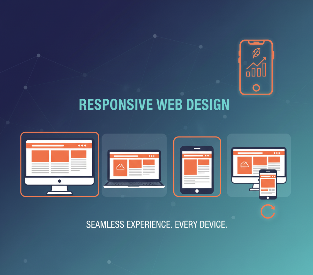
From an agency perspective, mobile design directly affects user experience and conversion rates. A responsive site ensures that content adapts seamlessly to any screen size, improving readability, navigation, and load speed — key factors that influence customer trust and engagement.
The Real-World Impact of Good Mobile Design
When users land on a mobile site that loads slowly or looks cluttered, they leave. Research shows that even a one-second delay can reduce conversions by 20%. In contrast, a well-designed mobile experience keeps visitors engaged longer, increases enquiries, and strengthens your client’s brand reputation.
At Intramind Solutions, we’ve seen firsthand how thoughtful design changes like simplified navigation, clear call-to-actions, and optimised visuals can boost mobile conversions by 30% or more. These improvements aren’t just aesthetic; they drive measurable results.
Core Elements of Effective Mobile Web Design
- Responsive Layouts: Use fluid grids and flexible images that adjust to any device.
- Fast Loading Speeds: Compress images and streamline code to improve performance.
- Touch-Friendly Interfaces: Buttons, menus, and forms should be easy to tap and navigate.
- Readable Typography: Choose legible fonts and maintain contrast for visibility in different lighting.
- SEO Optimization: Ensure metadata, structured data, and mobile usability all meet Google’s standards.
These elements help websites perform better across search engines and user experiences alike, giving your agency clients a genuine competitive advantage.
Key Points to Remember
- Mobile design affects SEO rankings, user retention, and conversions.
- Responsive design ensures accessibility across all devices.
- Fast-loading, touch-friendly layouts build user trust and engagement.
- Optimising for mobile supports long-term business growth.
FAQs about Mobile Web Design
1. Why is mobile web design important for SEO?
Google ranks mobile-friendly websites higher because they offer better user experiences. Without it, sites can lose significant visibility.
2. What is the difference between responsive and adaptive design?
Responsive design adjusts dynamically to screen size, while adaptive design uses fixed layouts for specific devices. Responsive design is more flexible for most businesses.
3. How can I check if a site is mobile-friendly?
Use Google’s Mobile-Friendly Test tool or simply open the site on different devices to check layout, speed, and readability.
4. What are the most common mobile design mistakes?
Tiny text, unclickable buttons, oversized images, and slow load times are among the biggest issues that drive users away.
5. How often should a mobile site be updated?
Ideally, review design and performance every 12–18 months to ensure compatibility with new devices and Google algorithm updates.